Timeline
2 weeks
Role
UX Research, Visual Design, Prototyping
Tools
Figma, Adobe XD, Useberry
Overview
King Green Infinity is a legal, recreational marijuana delivery company, participating in the social equity program in Massachusetts.
This program allows KGI to (a) negotiate wholesale pricing and (b) deliver cannabis products directly to the consumer.
Since cannabis delivery has only recently been permitted by the CCC (Cannabis Control Commission), there currently aren’t any similar services in the market. Being a new regulation, guidelines for compliance and imposition are still unclear.
In this project I was tasked with designing a mobile app to help KGI deliver its product to costumers, while establishing a strong brand-client connection and build trust.
_______________________________________________________________________________
The Design Thinking Process
Discover ▪️ Define ▪️ Develop ▪️ Deliver
Secondary Research
Diving into my secondary research, I interviewed the stakeholder and learned the characteristics of the main user target market:
They are mostly returning costumers;
Older demographic (35 and up);
Who consume cannabis regularly.
Then, I researched the cannabis costumer experience so I can understand it better. I found out that cannabis businesses can have opportunities to strengthen the emotional connection with consumers to increase loyalty.
Data Proves Customer Experience is Critical to
Cannabis Business Success
From the first moment that a consumer hears a brand name, through making a purchase decision, buying, and even after the purchase is made – cannabis businesses have opportunities to strengthen the emotional connection with consumers to increase loyalty.
According to Zendesk’s Customer Experience Trends Report 2020, 74% of consumers feel loyal to a specific brand or company, and more than half (52%) will go out of their way to buy from their favorite brands or businesses.
When asked, cannabis consumers ranked the most important attributes to them, product quality and convenience being pretty high on their list.
Competitive Feature Comparison
I’ve conducted a competitive feature analysis, which helped me identify opportunities by analyzing features from both direct and indirect competitors, based on users functional, emotional,
and social needs.
Direct Competitors
▪️Local dispensaries
(Tokr, Cannavisions, Theory Wellness)
▪️Weedmaps
▪️ Leafly
Indirect Competitors
▪️SommSelect
▪️Drizly
▪️DoorDash
Using this tool I’ve learned the themes:
not only what features are currently missing but also popular features our users are expecting to have.
The common features users are expecting to have were flower, CBD, edibles and accessories availability.
Features our competitors are currently lacking are delivery and subscription option.
Market Positioning Chart
Using the information I’ve gathered on features, I was able to create the axes for a market positioning chart, so I can visualize where KGI stands compared to the competition.
My axes were
- Subscription option
- Delivery option
I've learned that most of our competitors have neither, and while some of them offer delivery - and just one indirect competitor had both delivery and subscription option.
This way I was able to visualize our blue ocean - an untapped market space - a product that can offer both delivery and subscription options.
User Research
Keeping in mind my insights from business analysis, I’ve conducted user research to validate or invalidate these insights, and see what the users think.
I’ve had a survey sent out and received 41 responses.
I focused on consumers that are 35 years and older, being the target demographic based on the information I got from the stakeholder:
Quantitative Data
Having gathered quantitative data, I did 6 interviews to get more in-depth information with more context.
The main insight was the differences between younger and older target markets:
➤ Users’ demographics and habits - I've identified 2 main target groups:
(1) Customers of younger age group (up to 35 year old);
(2) Customers of older age group (36 years and older);
➤ Information is something that came up a lot- younger customers like to be informed, while the older crowd know what they want;
➤ Dispensary vs delivery service: younger customers like the dispensary experience while the older ones are worried of being seen at one because of stigma;
➤ Main motivations are - for both young and older crowd - high quality of product and trusted seller are important, as well as a discreet, professional and consistent experience, and ease of use.
Discover ➡︎ Define ➡︎ Develop ➡︎ Deliver
After gathering information on both competition and users, I was ready to start defining the challenge by synthesizing my data and turning it into actionable information.
Affinity Map
Starting with the affinity map, I grouped the information in a way that will help me visualize themes.
I broke down the gains and pains to the dispensary experience and the delivery service experience, to identify what gains we should try to incorporate into our product, and what pains should we avoid.
Gains for dispensaries
● Trusted seller
● Extensive supply
● Buying legally
Gains for delivery service
● Convenient
● Easier for customers who can’t drive - for disability reasons or logistically
● Delivery people are knowledgable
Pains for dispensaries
● Long wait time,
● Dealing with people,
● Stigma
Pains for delivery service
● Safety issues
● Payment - cash
● Minimum order amount
Value Proposition Canvas
Getting to know my users a little better I could identify what JOBS TO BE DONE they were looking to hire a service for, not only physically but emotionally and socially as well.
Physical Jobs: To get cannabis, in a quick and safe way;
Emotional job: Get information;
Social job: is actually not socializing- when our consumer purchase cannabis it’s important for them to have a discreet experience.
Our users gain peace of mind and safety, better time management, and information and knowledge,
And the pains alleviated are time-waste, being worried about stigma and feeling unsafe or frustrated from being rushed to buy without having all the information.
User Persona
Having collected information on my users, and keeping in mind their JTBD, I’ve created a user persona to better empathize with the users. This is a fictional character, assembled from the behaviors and motivations of actual users i’ve encountered in my research.
As-Is Scenario Map
Trying to understand Mila’s process, I’ve used the as-is scenario map to get a wide and general idea of what the user’s process looks like, and further understand what she was doing, thinking and feeling.
I’ve used a dispensary experience since there are currently no legal delivery options.
It validated my takeaways from the data, and showed me that while Mila likes to shop from a trusted seller legally, she is still frustrated with the time waste and the prejudice associated with dispensaries.
Journey Map
I used a journey map to describe the user’s experience in a detailed, visual form, that allowed me to understand their mental model, pain points and design opportunities, in the right context.
The scenario I was looking at is: Mila is out of cannabis and needs to get more, but doesn't have much time.
Having this holistic view of the experience, I identified some design opportunities:
(1) Design for a discreet, time saving solution;
(2) Design for consulting and testing option, sample sizes if possible;
(3) Design for feedback and from other costumers as well as education on best consumption methods.
Due to time constrains i didn’t design a secondary journey map; had I had more time I would’ve designed another journey for the other target group I've identified (younger crowd with more casual cannabis consuming habits).
Problem Statements & How Might We
The final step of the define stage is crafting problem statements and how might we’s,
I used the problem statements to synthesize the pain-points and opportunities I’ve uncovered during the research phase, while
How-Might-We statements help me reframe these problems as opportunities.
I’ve extracted 3 main problem statements and HMWs:
Discover ➡︎ Define ➡︎ Develop ➡︎ Deliver
The first step for developing our product was ideation, and the purpose was to ideate around each problem statement, coming up with as many ideas as possible.
My main ideas revolved around time-saving, discretion and information, but to determine which ideas will actually be implemented I had to prioritize them.
Feature Prioritization - Moscow Method & Impact vs. Effort
I used the Moscow method and the Impact vs. Effort Chart. These methods helped me decide which features will give me the maximum impact and benefit, at the lowest effort or cost.
Keeping in mind the data I’ve gathered - KGI’s users, their pain points, problem statements, and blue ocean - I’ve identified which features must and should be included in the product.
To make sure these features are giving me the value I was looking for - which is best product-market fit - I processed them using the value proposition canvas.
Value Proposition Canvas
To use the value proposition canvas, I first had to define the business value hypothesis:
Our cannabis delivery app will help people who want to purchase cannabis in a quick, discreet and safe way, by informing them about the product, delivering it to them regularly and building trust between them and the cultivators.
Product market fit is a useful Mental Model for the interaction between a business, its products, and its customers.
Having identified our business hypothesis, I was able to make sure the products and services KGI is offering are indeed what the customers want; these features will need to help relieve anxieties and stress associated with purchasing cannabis and stigma, as well as give our users peace of mind, time and information.
Key Distinguishing Feature - Recurring orders
The key distinguishing feature is the subscription option - having a product as a recurring order, that users can control through the app.
I researched what is called autopilot consumption: the Subscription Economy Index (SEI), which tracks subscription businesses on the Zuora platform, reveals that subscription businesses grew revenues approximately five times faster than S&P 500 company revenues (18.2% versus 3.6%) and U.S. retail sales.
In some customer segments, such as older millennials who have formed households, the penetration is even higher.
And while the reasons for subscriptions vary, we can see clearly they revolve around convenience and time-saving - which is backing up everything that came up in our research and data.
"By 2023, 75% of businesses that sell direct to consumers (DTC) are expected to offer subscriptions."
More Features
User flow chart
To understand how the flow of the features will look, I used a user flow chart, and designed what is called “the happy path” - to show how the key distinguishing feature, which is setting a product on recurring order, will work.
Discover ➡︎ Define ➡︎ Develop ➡︎ Deliver
Finally I was able To start the deliver stage - I used the fastest and cheapest method to start designing - which is lo fi testing.
I designed for our main user persona - these are older users, who don’t often use apps for shopping, don't need to be educated on cannabis and that value ease of use.
Lo-Fi Testing
The lo fi’s were tested by 5 people, and I learned that the flow felt intuitive but the wording was confusing. More issues that came up were:
- Subscription Toggle: (1) toggle is too easy to undo - users might accidentally cancel their subscription; (2) the toggle was too small.
- Sliders were confusing
- Save To Favorites Feature was not clear
Mid-Fi Testing
Moving on to design a more comprehensive prototype, I decided to change the tasks I was designing, and instead of saving a product to favorites, I asked users to edit a subscription.
- Users like the Meet The Farmers feature
- On some screens fonts were too small
- The ontology was confusing - specifically the word subscription. I changed it to recurring orders but would like re-visit the name of the feature.
Visual competitive analysis
Before I could start designing my Hi-Fi prototype, I had to do visual research to understand what the app will look and feel like.
I looked at 2 competitors: Leafly, and Tokr
I noticed a lot of white space - It’s clean with no unnecessary gimmicks - the only design decisions here are fonts and color play.
This indicates a professional and trustworthy business, as it came up in the data collected during desirability testing.
Crafting Atomic Design Inventory: The Process
Moodboard
I’ve created my moodboard keeping in mind the brand attributes that are: Integrity, Humility, Growth, Community, Education, Excellence.
In order to see if i can translate these attributes to visuals, I tested it for desirability.
People got from this moodboard a sense of earthiness, Quality and education.
“It feels earthy and modern at the same time”
“The lines and tones feel professional”
“There’s a stability to the hierarchy of typeface, and the quality of photos, that instantly builds trust”
"The more you know about the background you start to become less fearful of something that's so taboo"
Style Tile
Then I created my style tile - including colors, fonts and icons, did usability testing and was eventually able to craft my atomic design inventory.
Atomic Design Inventory
Finally, I created my atomic design inventory, that is used as an accelerator and meant to help design faster. It included the logo, typefaces, icons and colors.
I kept in mind accessibility and designed with bold colors and typefaces.
Since accessibility came up during prototype testing, I made sure to test for colors and contrast:
Introducing
King Green Infinity - Cannabis Delivery Experience
King Green Infiniti delivery app, is a cannabis delivery experience that is quick and discreet.
It allows users to set up their favorite products on recurring order, and connects them to their local cultivators.
These features are meant to build trust and increase the loyalty of the customers.
Subscription-Based Orders
Schedule your favorite products on autopilot,
control on the app anytime
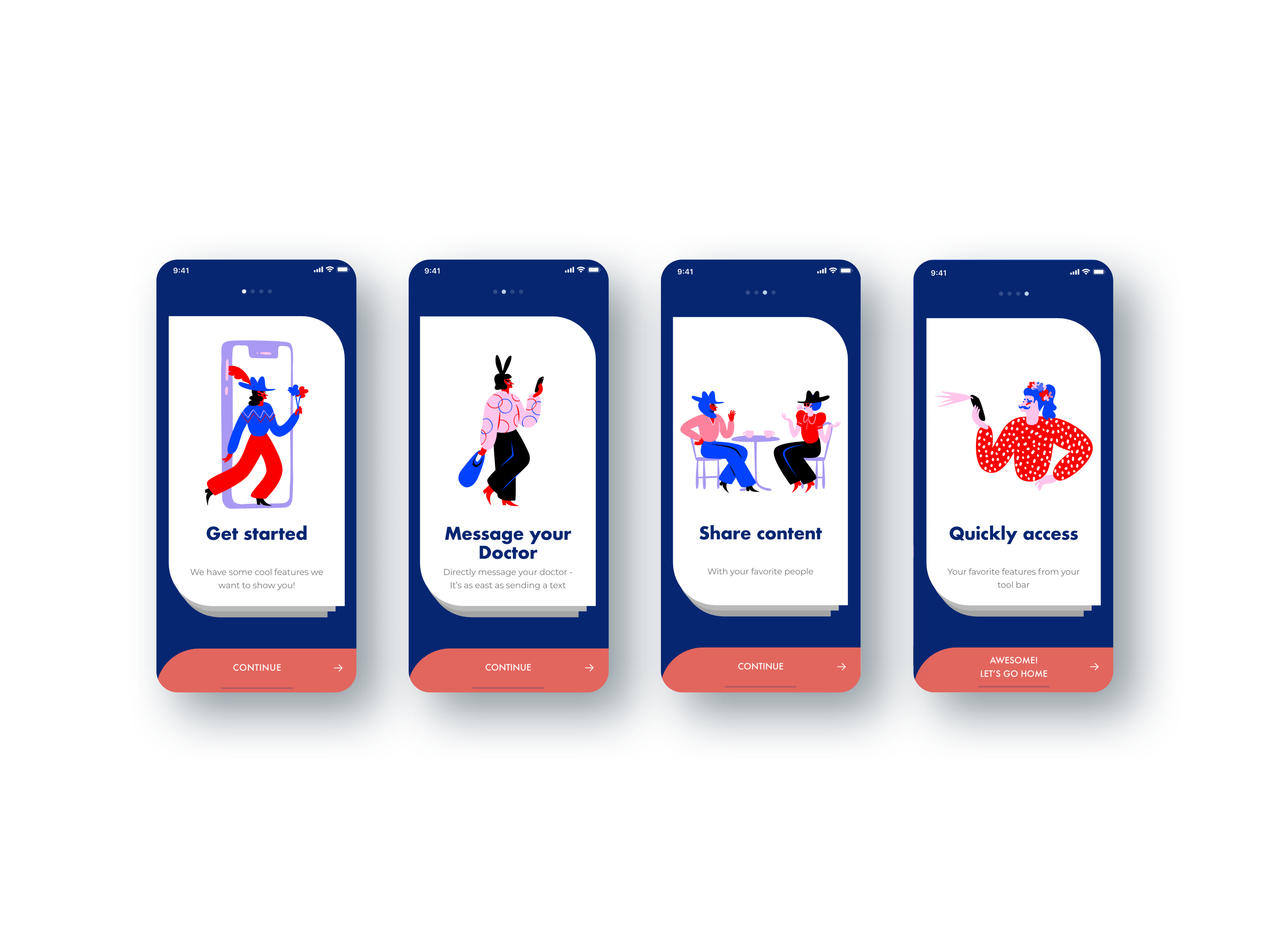
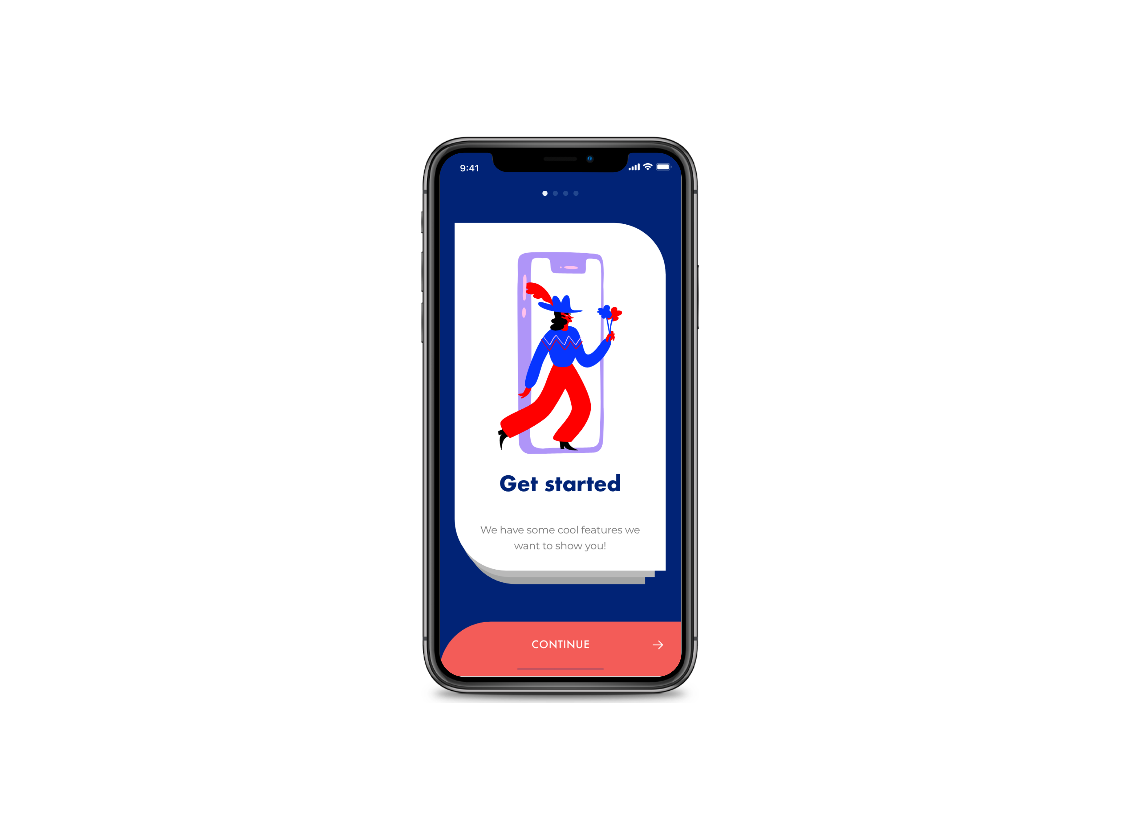
Onboarding Screens
Designed to help users get a comprehensive experience of the app
What's Next?
Next in the design process, I would like to continue to research compliance restrictions to be able to design within these restrictions.
I would continue to refine the UI and would develop the Meet The Farmers feature, as well as the educational part of the app, to establish more trust with the users.
Being the first to deliver cannabis in the state of Massachusetts is a huge opportunity for KGI, and I believe the right UX will help it achieve its dream to become the largest cannabis company on the east coast.


